User Journeys & Hierarchy
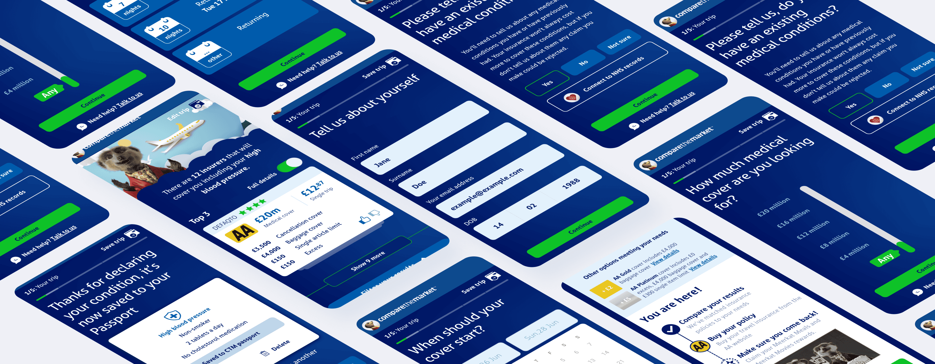
The existing journey involved lengthy scrolling forms that overwhelmed users. To improve this, the UX team identified weak points in the user journey and redesigned it to be more user-friendly.
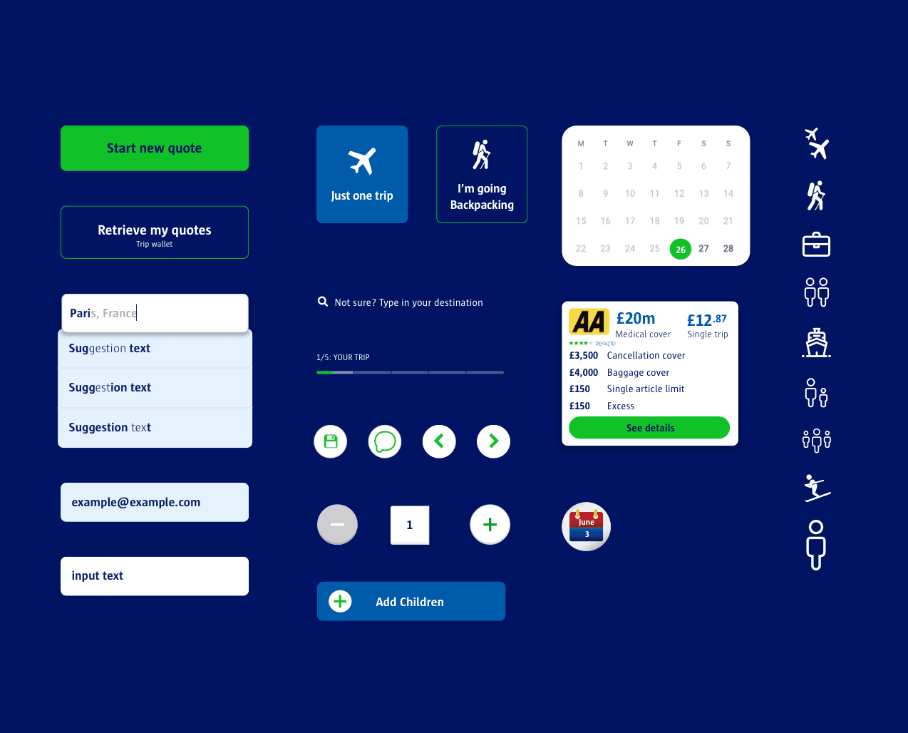
We transformed the journey from long, tedious forms into bite-sized, saveable sections. This approach provided users with a sense of progress and allowed them to save their progress, making the process less daunting.
Focused on making the user journey more intuitive by breaking down questions into manageable pages, enhancing the overall user experience on mobile devices.
Workshop Wireframes & ideation
Conducted collaborative workshops with multiple teams to generate innovative features and improve the overall user experience. These sessions facilitated the exchange of ideas and helped identify key areas for enhancement.
We brainstormed new features and gathered diverse perspectives, which were crucial for creating a comprehensive solution that addressed various user needs.

Quick workshop collaboration sessions
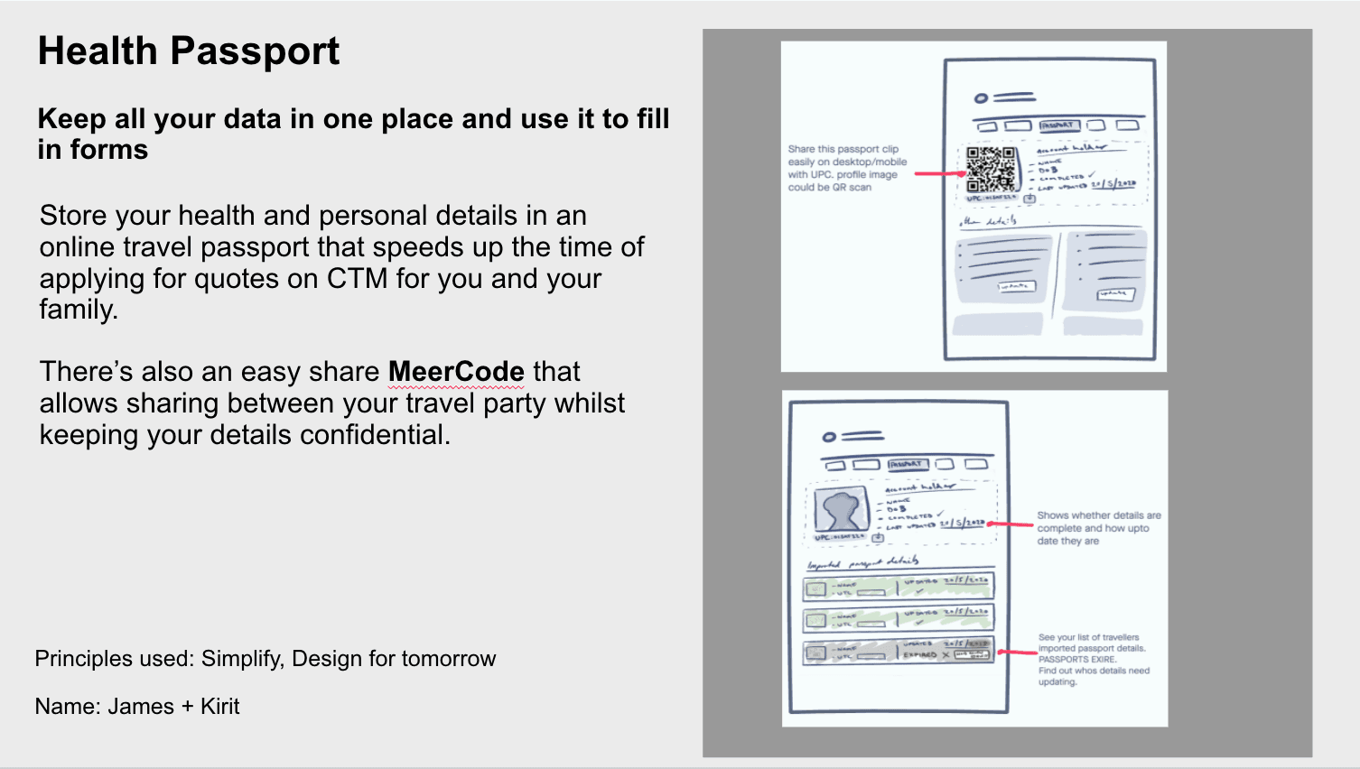
Saving & sharing Health data

Saving progress without signing up
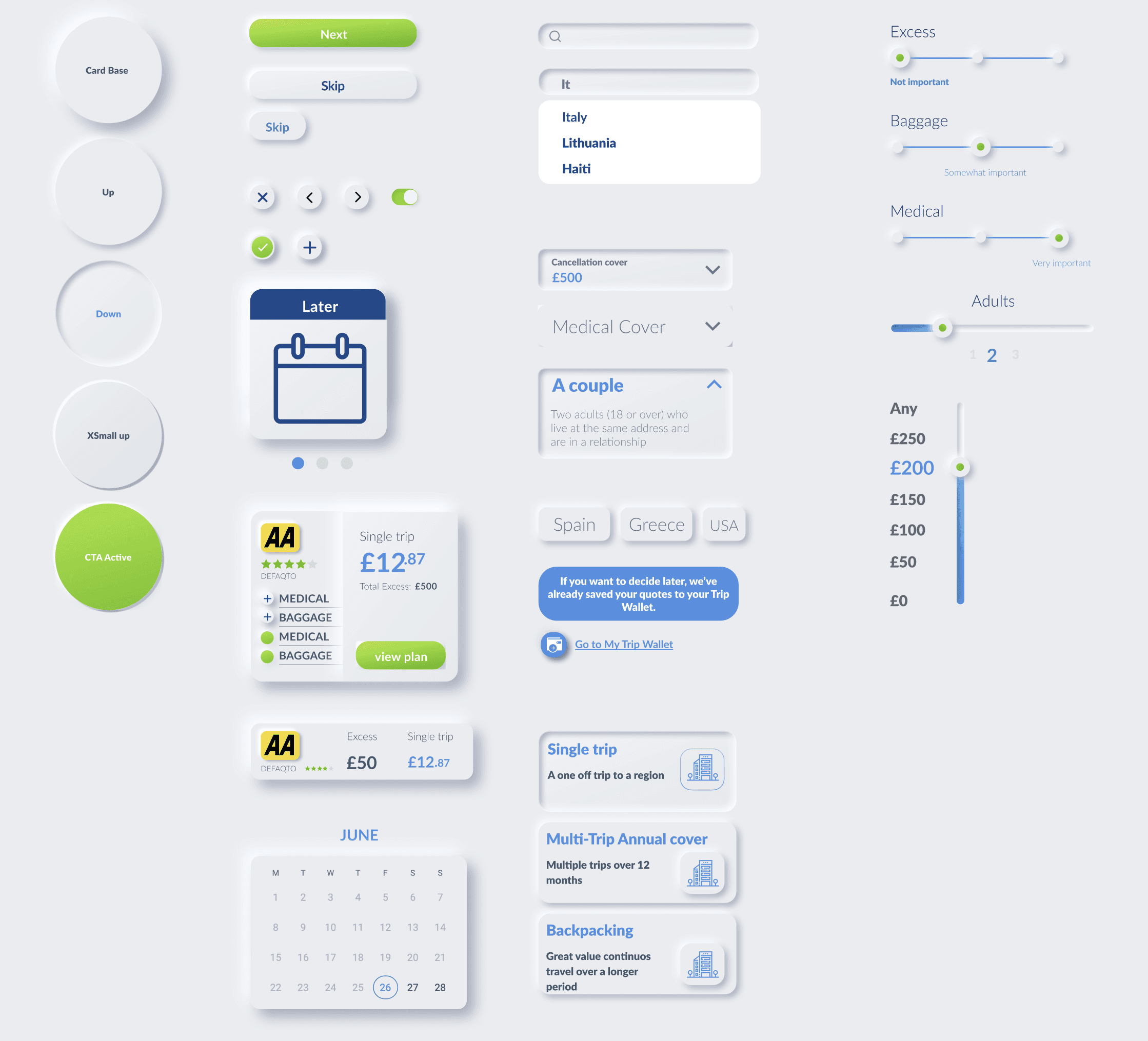
Ui Kits for new designs

low fidelity UX to UI
Challenges and Solutions
Incorporating Brand Identity: The primary challenge was to integrate CTM’s fun brand identity into a traditionally dry and tedious process. By injecting elements of delight and playful interactions, we transformed the user experience into one that was engaging and enjoyable.
Mobile Optimization: Ensuring that the redesigned journey was mobile-friendly was essential. We achieved this by breaking down the process into smaller, manageable steps and designing each element to be easily navigable on a mobile device.
Stakeholder Management: Collaborating with various teams and managing stakeholder expectations was critical. Regular workshops and presentations were held to keep everyone aligned and to incorporate feedback effectively.
Prototyping Interactions
As the dedicated UI designer on this project, I took the refined low fidelity user journey and created visually appealing, on-brand designs. This included designing new buttons, text fields, date pickers, and other interactive elements for each question type.
It was crucial that these interactions reflected the fun and engaging spirit of the CTM brand. I incorporated delightful animations and interactions to keep users engaged throughout the journey.
One of the significant challenges was effectively displaying insurance results on a mobile screen. We went through several design iterations to ensure clarity and ease of use without overcrowding the screen. This process involved extensive testing and feedback to achieve the optimal layout.