EPOS User journeys
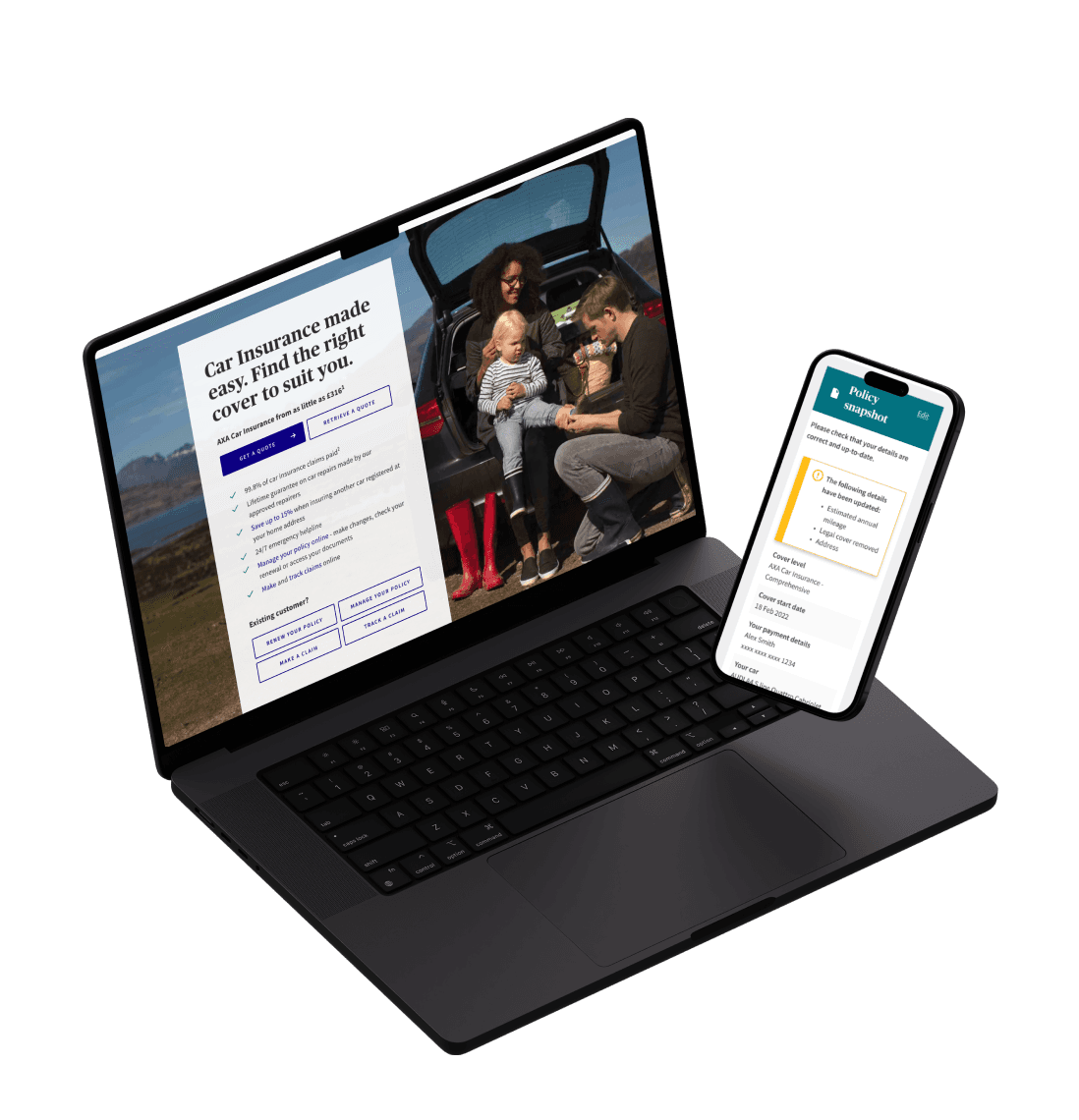
Collaborating with various UX designers, I tackled projects from different perspectives. One focus was on improving the in-store customer and staff experience by enhancing EPOS systems, optimizing screens for faster service, better clarity, and higher conversion rates. Another major area was refining the online phone purchasing journey, ensuring that optional extras were offered in a less overwhelming way. Working with extensive data, we generated hundreds of user stories and addressed them in bite-sized sprints across teams in the UK, Russia, and India. I created prototypes based on UX proposals, adding interactions that enhanced clarity and enriched the customer experience.
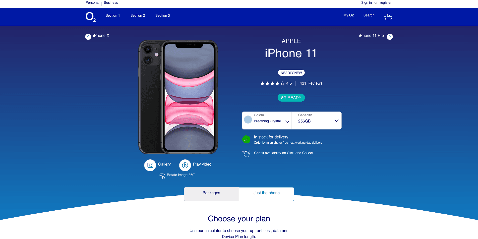
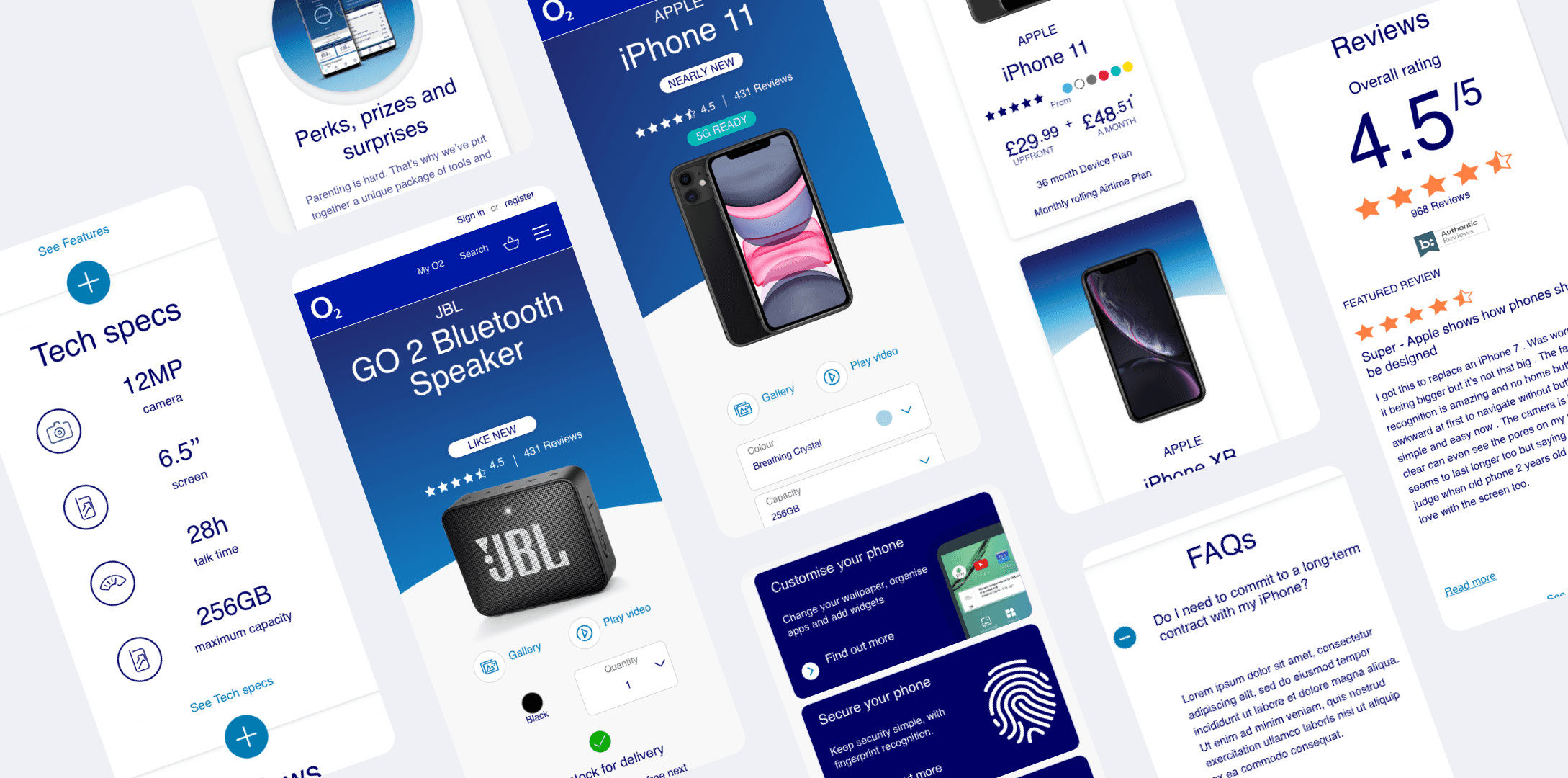
During my time working with O2, I focused on the UI and interaction design for the e-commerce phone and package selection process. The project was meticulously organized, with each element on the pages documented as individual tasks on Trello, allowing the team to self-assign tasks and manage workload effectively within sprints.
One key aspect of the work involved designing interactive elements such as the phone colour picker and memory capacity selector. These components had to align with the O2 brand, be visually appealing, and user-friendly. Decisions were carefully made regarding the layout—whether to display swatches, text, or a combination, and how to stack or align options for clarity and ease of use.
Each design considered character limitations, ensuring that even the longest descriptions fit seamlessly within the interface. I also focused on maintaining visual harmony across the page, balancing the need for space, clarity, and brand consistency. The end result was a cohesive, intuitive experience that resonated with O2’s brand values.

Add/remove basket items

Basket Error

Empty basket
Ways of Working
To manage the development of our UI components effectively, we utilized 'Craft,' a Sketch plugin that allowed us to establish robust library version control. This ensured that our design elements were consistent, up-to-date, and easily accessible across the team. Additionally, we leveraged InVision's functionality to present and share our work with developer teams seamlessly. This integration enabled us to maintain alignment between design and development, providing a clear, interactive representation of our designs that developers could reference throughout the implementation process. The combination of Craft for version control and InVision for collaboration ensured that our designs were executed with precision and consistency, staying true to the O2 brand vision.


Throughout various tasks, the interaction design of components played a crucial role in both understanding their function and enhancing user enjoyment. Using prototyping tools such as Principle and InVision, I created a series of animated prototypes that brought these interactions to life. These prototypes were instrumental in helping developers realise my vision through the lens of the O2 brand, ensuring that each component was not only functional but also engaging and aligned with the brand's identity.