The primary challenge was designing for platforms with vastly differing capabilities - Foundry, Quiver, and Slate. Balancing these varying capabilities while maintaining a cohesive user experience was complex. Additionally, the organization had limited experience with designers and often disregarded user experience, accessibility, and underestimated project timelines. They initially favored information overload on a single page, which was unsustainable and overwhelming. To address this, we often designed in ways that seemed "incorrect" at first to demonstrate the benefits of a more user-friendly approach. A secondary challenge was ensuring a good user experience within platforms, considering the intricacies of developer implementation.

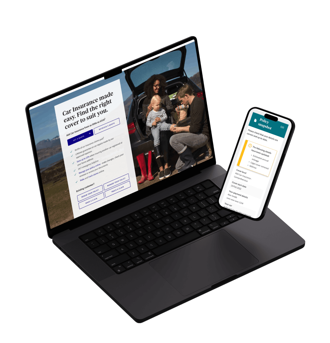
Our mission was to create robust Covid-19 data dashboards for healthcare professionals and staff across the nation. These dashboards allowed swift, easy data consumption, with the flexibility to break down data by national, regional, and individual practice levels. Distinct access levels were tailored to different staff roles. Our project focused on Foundry, Quiver, and Slate platforms, each with its unique requirements. As Lead UI Designer, I spearheaded user-centric designs, collaborating closely with stakeholders, and ensuring design consistency. This initiative was instrumental in providing vital, data-driven support to healthcare professionals during the pandemic.

Quiver hybrid library
Tableau basic library

Slate HTML5 library
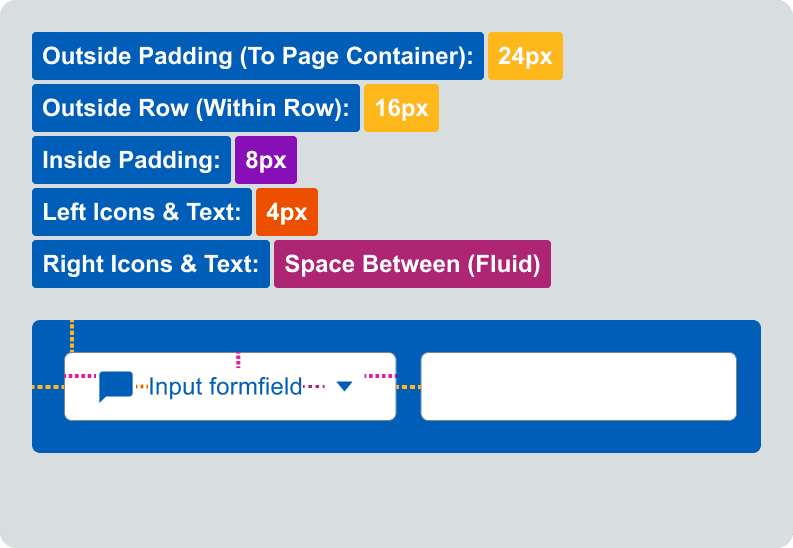
Spatial System
Establishing a spatial system is a fundamental requirement to ensure a consistent look and feel within a design system.
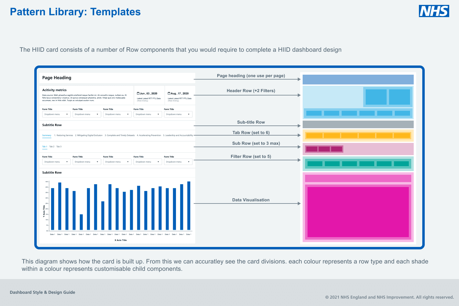
Quiver isnt structured using page grid layout, but in a table like build, designing within rows.
Each component will share properties in at the very least spacing within itself, between other components and within card rows.
Atomic design Structure
The Foundry Design system has been built based on Atomic design principles.
Atomic design is a methodology composed of five distinct stages working together to create interface design systems in a more deliberate and hierarchical manner.
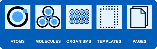
Atomic design is not a linear process, but rather a mental model to help us think of our user interfaces as both a cohesive whole and a collection of parts at the same time. Each of the five stages plays a key role in the hierarchy of our interface design systems.This methodology helps with design consistency and also helps Increase time efficiency during design changes.


Data Visualisation
I spent a considerable amount of time developing components that would become versatile and interchangeable while remaining connected to the design libraries. These Data visuals would perform within other organisms and made making proposed dashboards super fast.


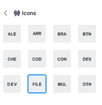

Icon System
I structured Icons to include a visual representation of their subcategories within the design panel making selecting icon families much faster
Personas
Working with UX researchers I helped create persona documentation surrounding the users of the systems we were creating for.

Developer aid
To simplify the developer's workflow and ensure quick access to crucial design guidelines, I curated a Developer Checklist. This concise, user-friendly document condensed the key information from our extensive 100+ page style guide. It also included hyperlinks to in-depth explanations within the style guide for those requiring further context. This streamlined resource empowered developers with a reference they could conveniently consult, reducing the time spent searching for details and promoting efficient, consistent design implementation.